Tuesday, February 13, 2018

Photoshop: The Gondola

Assignment:  We have accepted an assignment from a client to take a dull, scanned photograph and improve it for use in a poster, brochure, web site, etc.  The client has scanned a photograph of a gondola, but they think it is too hazy... and they don't like the speedboat in the center of the picture... and "the colors are a little blah".  We will use PhotoShop to correct these issues... and more.

Photoshop Tools/Options Used:
  • Ruler
  • Rotate Canvas
  • Crop
  • Levels
  • Clone Stamp
  • Dodge
  • Burn
  • Replace Color
  • Magic Wand
  • Paste Into
  • Free Transform

We will be using the following images to create our final project:
(Right-click each image and save to your computer, then open them in Photoshop.)


Part I: We will begin with the Gondola picture (p_start.psd):
  • Select VIEW > FIT ON SCREEN (shortcut is CTRL+0) to see the image as large as possible
  • Select the RULER tool (sometimes it's hidden under the EYEDROPPER) -- a shortcut is SHIFT+I which toggles through that toolset.
  • Drag the ruler along an edge that should be straight (i.e. the edge of the tower).
  • Select IMAGE > ROTATE CANVAS > ARBITRARY...
  • A suggested rotation is already in place based on your ruler line (this tool is trying to make the ruler line vertical or horizonal)... so click OK.
  • Use the RECTANGULAR MARQUEE tool (the box shape) to select as much of the picture as possible without including the black border (it's okay if you don't get all of the photo in the square).
  • Select IMAGE > CROP
  • Select VIEW > FIT ON SCREEN (again, to see the maximum image size)
  • Select IMAGES > ADJUSTMENTS > LEVELS
  • Drag the "black triangle" in toward the very beginning of the "mountain range" -- and do the same for the "white triangle" (click the "Preview" box to toggle this change to preview what it is doing) then click OK.
  • You now have a brightened, cropped image to work with for the next part.
Part II: Removing the Motor Boat / Using the Clone Stamp
  • Click the CLONE STAMP tool
  • Move your pointer over to a clear area of water -- about the same distance/depth as your motorboat (i.e. somewhere in the same horizontal line) and ALT+CLICK.
  • Move your mouse over to the center of the motorboat and slowly paint over the boat.  Notice the "+" shape where the CLONE STAMP is copying from.
Part III: Adjusting Highlights and Shadows
  • Click the DODGE tool (it looks like a black pushpin) and set the Range for HIGHLIGHTS and the Exposure to around 10%.
  • Adjust your brush size as necessary with the [ and ] keys.
  • Brush over the red and white striped tarp and notice how the highlights are getting brighter.  Try this on other tarps and the side of the boat which seems to get shinier.
  • Click the BURN tool (it looks like a hand pinching and is found under the DODGE tool) and set the Range for SHADOWS and the Exposure to around 5%.
  • Adjust your brush size as necessary with the [ and ] keys.
  • Brush over the boats/tarps just to get a little contrast.
Part IV: Replace the Orange Tarp
  • Use the ZOOM tool (it looks like a magnifying glass) to zoom in on the orange tarp -- making sure you can see the entire thing.
  • Use the LASSO tool and draw around the orange tarp (making a selection)
  • Select IMAGE > ADJUSTMENT > REPLACE COLOR
  • Click on the orange part of the orange tarp.  You should see a faint "mask" of the orange shape appear in the Replace Color box.
  • Hold down the SHIFT key and Click and Drag around the orange tarp trying to select ONLY the orange areas.  If you over-select (i.e. you accidentally go into the black) you can start this step over.
  • When you feel like you have a nice, sharp "mask" of the orange tarps shape, drag the HUE slider left and right.  Notice the colors changing on your image.
  • If you adjust the SATURATION slider and the LIGHTNESS slider, you can actually match the colors of the other tarps on the boat.
Part V: Make Blue Skies From Gray
  • Open the Clouds picture (p_clouds.psd).
  • Click on SELECT > ALL (or do CTRL+A)
  • Select EDIT > COPY (or do CTRL+C)
  • Go back to your Gondola picture.
  • Click the MAGIC WAND tool (SHIFT+W toggles this)
  • Click in one of the "gray" areas of the sky and notice how it selects some of the building tops.  We don't want that.
  • Drop your TOLERANCE down to 10 and see how that works.  Notice that it [probably] doesn't select the entire piece.  We can compensate for that by holding SHIFT and clicking in the "unselected" areas.
  • Continue SHIFT-Clicking the other "gray" areas of the sky throughout the picture.
  • Select EDIT > PASTE INTO (not PASTE)
  • Notice how ugly and unnatural this looks?  Don't worry -- go over to the OPACITY setting (above your LAYERS) and drag that down until it looks natural.  Mine is about 37% [this time].
  • When you are satisfied with your final product, select LAYER > FLATTEN IMAGE.
Part VI: Make the Before and After
  • Go to IMAGE > CANVAS SIZE
  • Change "inches" to percent and change the width (since this is a picture that is taller than it is wide, a side-by-side comparison works best -- so we will adjust the width) and change the 100 to 200 (making it twice the width).
  • Click on the Right Arrow (this means you want your current picture -- the "after" -- to be on the right) and click OK.
  • Copy your original image (in this case, p_start.psd) and Paste it into your finished image.  Use the MOVE tool (the black arrow) to drag it to the left side.
  • You may want to use your FREE TRANSFORM to rotate and resize the original so it fits better.
  • Add your name to the finished image.
  • Save your completed file as a JPEG image to your Thawspace. 
Part VII: Add to Your Portfolio
  • Go to your Blog (http://www.blogger.com/) and sign into your account.
  • Click New Post and make sure "Compose" is selected.
  • Click the IMAGE/PICTURE button.
  • Browse for your picture (from your Thawspace).
  • Add a description about the steps you completed or the process you used in putting this together.  You could even add the reason you did the project (e.g. A virtual client wanted you to clean up an image to use for print/online media).
  • Click PUBLISH POST.
  • Click VIEW BLOG.
If you have difficulty following along and would like to work on this from home, here is a tutorial using the same images:


Monday, February 12, 2018

Photoshop: The Veggie Head

Today we will explore some of the basic Photoshop tools and concepts, and then we will begin our first official Photoshop project -- the Veggie Head.  The Veggie Head project is a classic Photoshop tutorial which teaches you how to use a variety of tools and techniques to accomplish a seemingly easy task.
The task for today:
  1. Right-click the image above and select "Copy Image" (or "Copy Picture" depending on your browser)
  2. Open Adobe Photoshop
  3. Go to FILE > NEW (notice the size of the new image is the same size as the image on your "clipboard")
  4. Go to FILE > PASTE (you should now have two layers -- the veggies and a white background)
  5. Your task is to take the various pieces, copy them, paste them, and clean them up to create a "Veggie Head".  Some examples can be seen below:


Tuesday, February 6, 2018

My Lab Design (208)


Sweet Home 3D: Importing Floor Plans

Friday we finished working on our Sweet Home 3D house design. You should have taken several "photos" of your house and uploaded them to your portfolios.

Today we are going to continue using Sweet Home 3D, but we will be importing a pre-made floor plan.  You can locate floor plans from a variety of locations on the web.  One place to find nice plans is TheHouseDesigners.com -- a site which includes the ability to search for single stories, a certain number of bedrooms, etc.  Another way to find plans is to do a Google Search.  The important thing to remember is that you will need a plan with some measurements so we can correctly scale our models.

We will import the base floor plan, set the origin point [to the upper left], draw the walls, add doors and windows, and then decorate and furnish our house.

When finished, we will post the floor plan and "photos" of our completed model.


INSTRUCTIONS:
  1. Locate a floor plan with dimensions and save the image to your Thawspace
  2. Open Sweet Home 3D
  3. Go to PLAN > IMPORT BACKGROUND IMAGE... > CHOOSE IMAGE
  4. Select the image (floor plan) you saved in step 1
  5. If the image looks correct, click CONTINUE
  6. Adjust the blue line to span across a room with known dimensions (i.e. a room that is 10'6")
  7. Enter the number of inches your line represents (in the example 10'6" would be 126)
  8. When asked for the Origin Points just leave it at 0,0 and click CONTINUE
  9. Draw the walls as indicated on your floor plan
  10. Create rooms using the Room Tool
  11. Add windows and doors
  12. Add colors/textures to the walls, doors, windows, ground, sky, etc.
  13. Lock your "Base Plan" to prevent changes
  14. Furnish your house
  15. Make necessary adjustments (you may need to unlock the base plan)
  16. Begin creating "photos" of various locations / points of interest in your house
  17. Add your floor plan and photos of your house to your portfolio

Sweet Home 3D: Taking Pictures

Today I want you to begin exploring the "Create a photo from 3D view" button (it looks like a black camera at the top of the application).

Notice the examples (left) where you see the original in-app version and the rendered "photo" with lighting and shadows.

The scene shown here is created from the floor plan on the right.

Once you have created and saved some "photos" of different rooms in your house, you can upload them to your portfolio.  I would like to see at least 4 different rooms in your examples.

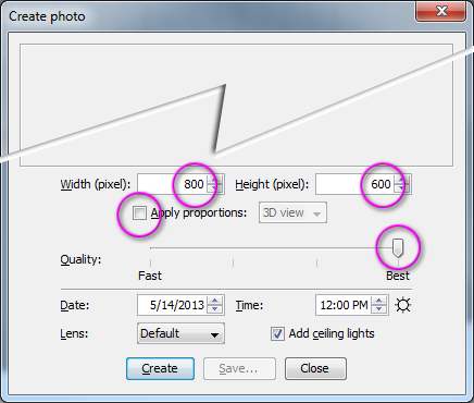
When you click the black camera button you will see a dialog similar to the following picture:  Note that you should uncheck the "Proportions" box, change the size to 800 x 600, and select "Best" for quality

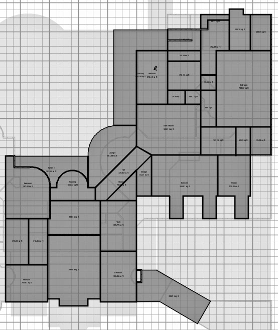
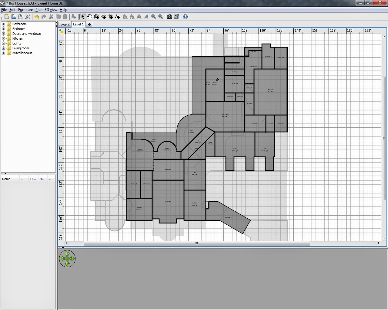
Finally, I would like you to take a screen shot of your floor plan.  If you press the "Print Screen" key on your keyboard a snapshot of your computer screen will be saved to memory.  You can then open Photoshop, do a FILE > NEW, and Paste.  You will see something similar to the following images -- one is the original and one is cropped.


Monday, February 5, 2018

Rule of Thirds

The most basic principle in photography, layout or design is The Rule of Thirds.  The basic idea is that you can divide your photo into an equally divided 3x3 grid with focal targets [sometimes called "sweet spots"] occur at the line intersections.  Photos that the human eye perceives as good or powerful tend to follow the Rule of Thirds.  Even the masters -- painters from hundreds of years ago -- used the Rule of Thirds... although it didn't really become a "rule" until photography came into being.  And even then... it's more of a guideline.  :)

So how do we use the Rule of Thirds in our own compositions?

If you were to look through a viewfinder or at a camera screen you can divide it into thirds by mentally making a Tic-Tac-Toe grid:
Many cameras have a grid or boxes or "corners" indicating where the "sweet spots" are in the photo:

Some phone apps (the iPhone Photo App, for example) have pre-built "Rule of Thirds" helpers:
The idea is that the human eye focuses most on the areas where the lines intersect.  So if we put the focal point of the photo in one of the intersections, the image becomes more attractive or interesting.
Another use of the Rule of Thirds is to place the subjects eyes on the horizontal line.  Ideally one of the eyes would be on one of the interesctions, while the eyes would be looking to the opposite side into the empty space.  This image of a cat is fairly close.
If you are taking (or cropping an existing) landscape photograph, the Rule of Thirds can be used to help add interest to the shot.  Sometimes the horizon line is on [or close to] one of the two horizontal lines.  Sometimes the picture can be divided into three areas -- the foreground, the focal point, and the background.  In the example below, the horizon line follows the bottom line while the subject of the photo is exactly on the interesection.
Here are a few more examples demonstrating the Rule of Thirds:

Now look at the following photographs and see if they follow the Rule of Thirds -- and if so, in what ways:


The Rule of Thirds is utilized in movies as well as photographs.  This is an example of a commercial with the Composition Lines overlayed on the movie.
This guy did a music video about the Rule of Thirds:

A more advanced explanation about the Rule of Thirds can be seen in the video below:

http://blog.muddyboots.org/2007/07/rule-of-thirds.html

http://www.everydayhdr.com/?p=1367


By comparing three different shots, you can see how the placement of the subject in the photo makes a difference in impact.


Remember, that although these are called "rules", they are really more of a suggestion. There are always exceptions to these rules. This photograph, for example, had a very strong subject, it was a simple design, and it broke the rule of thirds -- but it's still a powerful image.

Beginning Composition and Layout

The first and perhaps the most important guideline is simplicity. Look for ways to give the center of interest in your pictures the most visual attention. One way is to select uncomplicated backgrounds that will not steal attention from your subjects

We chose the cactus as the main subject. And by moving in closer and using the plain sky as the background, we have simplified and improved the appearance of this photograph.

We're certainly close enough to our subject in both pictures, but the busy background on the left camouflages the seagull. Just change your point of view slightly and, presto, your seagull stands with visual prominence against the blue sky.

Compose your photograph so that your reason for taking the picture is clearly seen. Arrange other parts of the picture area in such a way as to complement what you choose to be the center of interest. Most of us would prefer the picture on the right because the parking lot tends to contradict the feeling of antiquity related to this mission.

So, you can simplify your pictures and strengthen your center of interest by selecting uncomplicated backgrounds, avoiding unrelated subjects, and moving in close. If you want to make your center of interest even more dynamic, place it slightly off center in your frame as we have done with this young artist.